Dun Works brand
Brand architect and copywriting: Justine Gaubert
Graphic designer: Jonathan Wilkinson (Also an artist and illustrator - check out his website We live here.)
Client: South Yorkshire Housing Association
Check out my TED talk for the lowdown on this one, but our brief was to create a brand, brand values and a campaign for a new residential development in Kelham Island.
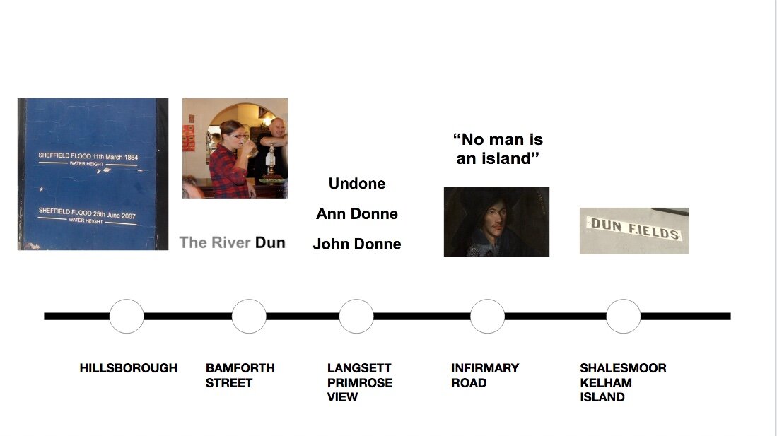
On the tram on the way from the recce, my mind leapt from the name of the road where the development was going to be built (Dun Fields Road), to the metaphysical poet John Donne, to the River Don (or the River Dun as it was called in Celtic times), to the flood-lines painted on the side of the Fat Cat pub when the River Dun broke its banks in the Great Sheffield Flood of 1864.
You can (kind of) track the thought process in the visual above, and some of the resulting brand and campaign items below.
Sadly the suggestion of bog roll (for the dunny, obviously) wasn’t taken up.
Big ups to Miranda Plowden who was the brainchild behind this project (and hundreds of others). She’s worked across Sheffield and South Yorkshire for over 30 years, and has some really interesting stories about placemaking across our city on her new blog. https://www.mirandaplowden.com/


